How to Design a Website That Actually Helps People Move Forward
Recently, we had the opportunity to deliver a private workshop for a local startup accelerator cohort of blockchain founders. The full cohort program is designed to give these founders the a broad and comprehensive foundation for success in all aspects of their business. And we were so excited to address a piece of the puzzle that often gets excluded....
The products were strong. The thinking was sophisticated. The websites? Not always helping.
This is something we see often. Founders spend months refining their technology, but their website ends up trying to say everything at once. And when a website tries to say everything, it usually ends up saying nothing clearly.
Here are some of the key takeaways from our workshop for your education and enjoyment!
Back to top
What is Conversion Architecture?
Conversion Architecture is the intentional design of how people move through your website. We always like to remind our clients that their website isn't just there to look pretty. At the end of the day it has a job to do - drive meaningful business. It’s a decision-making environment. And the goal is to optimize the site so that anyone who lands on your site moves from interest to intent to action as efficiently as possible.
Every visitor arrives with uncertainty. Your job is to reduce it.
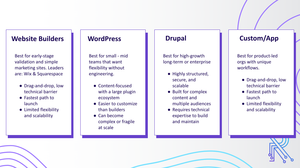
Step 1: Know Your Platform
While you should be able to implement each of the strategies for conversion that we'll outline below, the options available to you to customize your site will very depending which platform your site is built on. Consider that there will be certain pros and cons to each.
The Website Engagement Flow
The customers journey on your website can be thought of in three phases: Intent -> Education/Confidence -> Action.

When we say "Intent", we mean the reason a visitor has come to your site. Different audience segments (more on that in a moment) may have different reasons for seeking you out and be looking for different things once they land on your page.
The next phase, is about educating your audience and building their confidence in your brand and your product or service. You want to make sure that everything you put on your site (blogs, reports, videos, graphics, etc) is helping to tell your story and encouraging your site visitors to get to the final step...
... Action! This is the conversion point on your website - you may have one conversion point or several depending on the complexity of your offering. This is when a visitor essentially raises their hand to reach out and let you know they are ready to engage with your business. This might look like a request form, an app sign up or a contact us form.
Back to top
Defining Your Audience
The the most important foundational step is to understand exactly who your website is for. You may have one audience segment or several depending on the complexity of your offerings. Each segment will have a specific needs and will come to your site looking for something different.
Different audience segments have different ideas, knowledge, levels of intent and need to be guided in different ways.
That means staying on top of market trends and industry conversations, actively gathering feedback through surveys, interviews, and user testing, and closely monitoring site analytics to see how visitors actually behave. When you combine market research, direct customer insights, and real performance data, you move beyond guesswork and make informed decisions that improve user experience and drive measurable results.
In the end you want to be able to answer these questions about your core audience, or each audience segment:
Key Questions to Understand Each Segment:
- What problem or pain point are they looking to solve?
- How are they currently addressing this issue?
- What are their overall goals and objectives?
- What are their objections and/or roadblocks?
If you can answer these four questions for each of your target audience segments, you will have a solid foundational understanding to guide your website conversion plan.
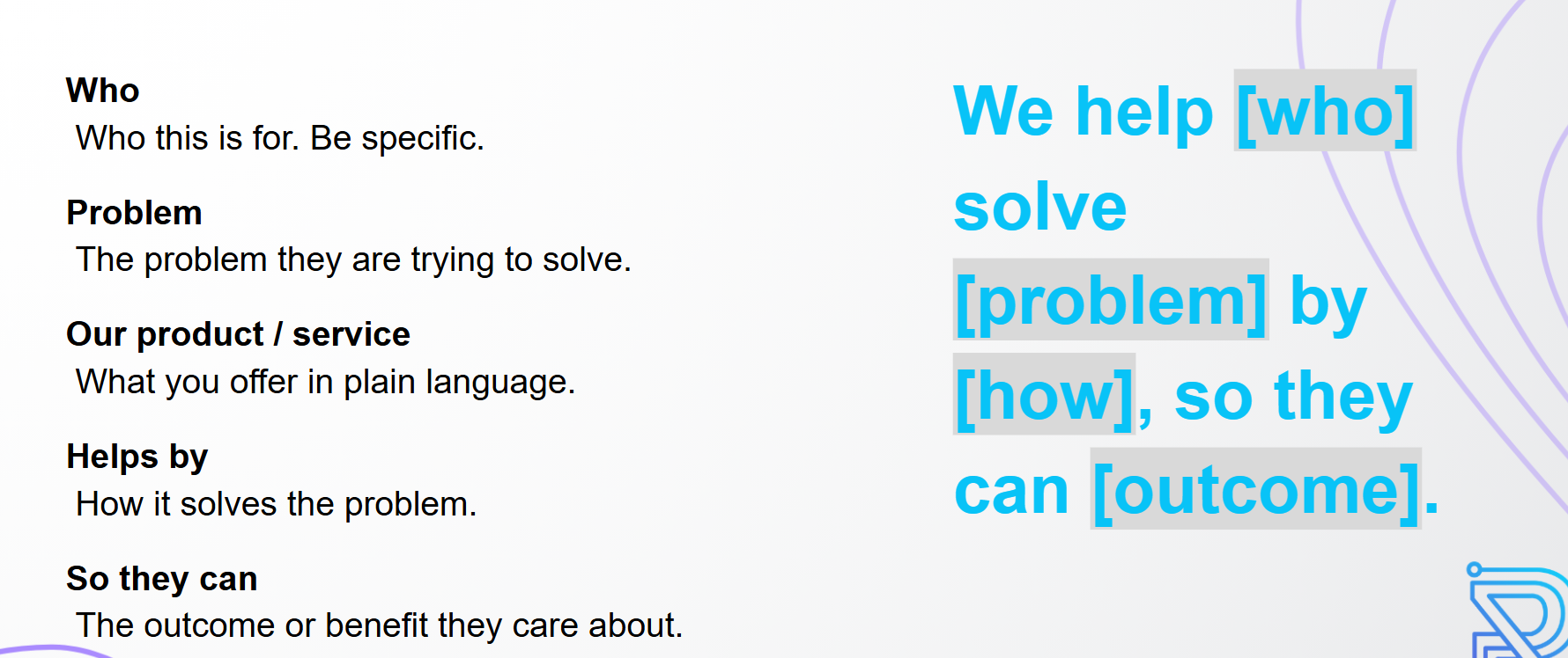
Build a Value Statement
Once your have collected all the info you need about your target audience, you're ready to build your value statement - the single sentence declaration you can make about exactly what you do for your core audience (or audience segment). If you do it right it should look like filling in a mad lib:
Build a Customer Profile
When you define who each group is, what they care about, what problems they are trying to solve, and how they make decisions, your messaging becomes sharper and more relevant. Instead of speaking to everyone in general terms, you can address specific needs, objections, and motivations. That clarity influences everything from your homepage copy and calls to action to your content strategy and offers. A well defined customer profile turns assumptions into strategy and helps you design experiences that actually resonate and convert.

Back to top
Building UX for Conversion
Now that you have a complete understanding of who your audience is, what their needs are, and how your business addresses those needs, it's time to turn to planning into action! Your User Experience defines how someone actually experiences your site in real life. This is where we have the ability to influence what actions a visitor takes on your site by the choices we make in the copy, design, and layout of each page:
- Intuitive Navigation: Make it easy for users to find what they're looking for. The navigation is extremely important, if not structure properly, it will cause audience to leave your website.
- Clear Information hierarchy: Organize your website content for quick and easy update of information.
- Calls To Action (CTAs): Make it obvious how visitors should engage on your site.
- Friction Free Forms: Make it as easy as possible for users to convert on your site.
Now let's look at each of these in turn.
Intuitive Navigation
Navigation is how people understand what is possible on your site, and it's one of the may ways a visitor can quickly figure out what you offer, who it is for, and where they should go next. The top navigation bar on your homepage should be simple with as few options as possible make decisions easier. For a more complex site, consider "nested" menu options with drop-down lists for grouping pages.
Here's a great example

And businesses often sleep on the footer but it’s a surprisingly source of website engagement! As UX professionals, we tend to dedicate our time and energy to everything above the fold.
However, users intentionally scroll to the footer to find information they expect to appear there, such as contact information, details about the company, social media posts or links, or even to discover new or related content on the site.
Confidence Building Copy
Page copy is one of the most powerful components of your conversion architecture because it bridges the gap between interest and action. Design may capture attention, but words create understanding and trust. Strong page copy clarifies who the page is for, explains the value clearly, addresses hesitation, and guides the reader toward a specific next step. When your copy is vague, overly clever, or focused on your company instead of the user, conversions drop. When it is clear, relevant, and benefit-driven, it moves people forward.
Here are a few actionable tips to strengthen your page copy:
- "Scannable" copy always performs best. Use simple, natural language and short sentences.
- Make your headline specific about who the page is for.
- Focus on benefits first, then explain features.
- Break up text into short paragraphs and clear subheadings for easy scanning.
- Address common objections directly to reduce hesitation.
- End each section with a clear next step or CTA so it's clear what to do next.
Clear Calls To Action
And speaking of CTAs, each page should have one clear primary action. You can have supporting actions, but they should not compete with the main goal.
Your CTA language should be direct and action oriented. Keep it short. Make it visually distinct. Place it where people naturally pause and consider their next step.
If someone has to search for what to do next, you have already introduced friction.
Forms for Lead Capture
Forms are where conversion architecture becomes tangible. A form submission is a clear signal of intent, but it also represents effort and trust from the user. Every additional field creates friction, so your job is to make the process feel simple, fast, and worthwhile. The structure, wording, and length of your forms directly impact whether someone completes them or abandons them.
A few quick tips to improve your forms:
- Only ask for information you truly need.
- Keep fields to five or fewer whenever possible.
- Start with easy questions to build momentum.
- Make labels and error messages clear and human.
- Always show a strong confirmation or thank you message after submission.